
It's Time To Step Up Our Game
OSR does NOT stand for "Old, Stale, and Recycled..."

If you, the reader, live in any decent sized city, then there’s a good chance there’s a government building with large columns on its front. There’s also a chance those columns are fluted.
Anyone care to guess why they’re fluted?
Aesthetics you say? Of course… Doktor Rotwang isn’t stupid. But why are they fluted?
In the distant past, columns were added to the front of official buildings such as temples to hold up a roof or otherwise provide structural support. The columns were simply large trees debarked, carved and painted to be pleasing to the eye.
As buildings grew larger, they needed larger columns, so the architects of that time started warping large boards and wrapping them around in a column shape.
But… the seam between the boards was all too apparent, so some carpenter had the brilliant idea of fluting the boards to minimize the sight of the board seams.
Later, larger columns were made of stone and placed in sections. The stone cutters embossed the columns with flutes.
Why?
Because all the columns they had ever seen in the past were fluted.
It was the way it was always done.
Even today, many columns are fluted for no practical reason. It’s aesthetically pleasing, but serves no function.
It was the way it was always done.
Okay, so you’re probably wondering where I’m going with this. What has all this to do with tabletop publishing?
TSR products from the early 1980s, when many of us joined in on the hobby, had design aspects that are carried over into OSR products of today… not because of any function, but because that’s the way it was always done BITD.
Some examples are: dungeon maps surrounded by garish colors like blue, interior art that frankly looks like someone’s slightly talented kid brother drew it in study hall, covers also splashed with garish colors and the inevitable yellow band in the upper left corner in tandem with a product line designator (such as G1 or S5), and other similarities.
Why were so many of these design aspects used in the first place?
They all had function. The almost minimalist art came from starving artists who got to appear next to more talented artists such as David Trampier. They worked cheap. The garish colors on a dungeon map were there to discourage photocopying (something that plagued OD&D to no end). The garish colors of a module cover looked suspiciously like the cases of arcade games of that time period; it was pure marketing design. Modules were lumped into series to encourage the buyer to collect all in that series… even if they really weren’t connected.
All of these aspects, to a greater or lesser degree, had a function.
So, why do so many OSR writers and publishers follow the same design aspects?
Because that’s the way it was done when they were kids.
Now, not all OSR publishers are doing this, but every day my Facebook feed carries advertisements for new OSR products, and the cover design and sample pics are almost always the same.
These are the ones I scroll past.
It’s time we stopped this. Some already have. Anthony Huso is a prime example.
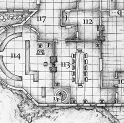
If you haven’t read it, get thee to Amazon and order his first work The Night Wolf Inn. It’s in my top 3 favorite OSR products. It’s imaginative, it comes from his actual campaign material, and its design sets it far above the average OSR product out there. Here’s a sample of one map from NWI:
(Hope you don’t mind, Tony Huso…)
It’s obvious the cartographer, Tom Fayen (!!!), drew this by hand. It was probably later enhanced with Photoshop to sharpen it. There are no garish colors because it’s as likely to be photocopied as it is to be faxed. It adds aesthetic details to the overall map such as bushes and rocks outside the Inn. Notice that it has all the functional aspects of old school maps… doors, furniture, the 10’ grid, and so on. Simple, yet useful… and enough detail to keep you looking and looking...
But you don’t need to hand draw maps, cool as that is. There are several excellent cartography software programs that, with a skilled hand, draw first rate maps that can be used online for battle maps. Many are breathtakingly beautiful without being obnoxious (admittedly some though are obnoxious).
The module’s covers don’t imitate some video arcade game from the early 1980s (and now you can’t unsee that, can you?). The front cover sports some ominous death figure in tandem with a hellish nightmare animal with the night mist in the background all out on the grounds of the Night Wold Inn. The rear cover illustrates an eternally cute elven woman who will probably rob you while you sleep. Back on the front cover, Mr. Huso designates this product as “HU1” but it’s so subtle you have to look for it, and he’s nodding to the past while moving on to the present. He also apparently told WOTC to cram the OGL.
Huso did this in 2016. This is the end of 2025.
Why are we still putting out product that looks like it belongs on that cardboard display at the end of the SF/Fantasy aisle in B. Dalton’s…?
Let’s stop. If the nostalgic look is the only thing bringing in the new customers, then it’s time to either create content that will catch their attentions or simply just move on.
Subscribe now to delve into the secrets of Fayn!